
Summary
This project was a rebrand for the Washington Trails Association, an organization focused on preserving and sharing Washington state’s natural beauty. Throughout this project, I was pushed to consider not only how my designs looked, but whether they evoked feelings appropriate to WTA’s goals, and how I could leverage them to effectively communicate WTA’s message.
This project culminated in a final Brand Guidelines book detailing the results of my work, as well as an interactive Figma prototype redesign of WTA’s mobile app. The final version of this brand guide can be viewed in its entirety and downloaded below.

Process
This project had six major stages:
Brand Audit & Client Research
Logo Design
Color Palette
Typography
Image Treatment
App and UI Design
I completed each of these stages over the course of a week, receiving feedback from peers and iterating on each week’s deliverable. After completing these activities, I compiled my work into a final brand guide for the Washington Trails Association, which is accessible through the button at the top of this project. Creating this brand guide not only pushed me to refine my designs to a professional level, but to consider the contexts in which they could be used, and better tailor my work for real world implementation.
WTA Brand Audit
When I approached this redesign, the current WTA brand appeared to use a completely different visual language across various platforms. The elements below, used to create WTA ‘s brand, succeeded in some aspects but mainly fell short of communicating the organization’s purpose and goals.

The current brand conveyed the tradition-based, classic aspect of the WTA, but overemphasized this characteristic at the cost of app/website usability and aesthetic communication of other goals. The WTA app, which was the aspect of this brand I chose to completely redesign, appeared to use a completely different visual language from their website. Within their app, information hierarchy wasn’t accurately reflected by design and typography choices, making navigation of the app somewhat clunky and difficult. Below are screens from the Washington Trails Association app in November 2019 when this Brand Audit was conducted.
Click to enlarge
Click to enlarge
Click to enlarge
Click to enlarge
Client Research
Client research revealed key themes that the WTA brand is founded on, which I distilled into keywords to help guide my design goals in recreating the WTA visual system. Fundamentally, WTA’s goals evoke three major concepts.
Firstly, WTA emerged as a classic organization — one that has been established in their terrain, provides reliable and trustworthy information, and is rooted in tradition and longevity. Next, WTA promotes a communal sense of commitment - both among outdoors enthusiasts, and between humanity and nature. Finally, WTA’s campaigns are largely service-driven. Beyond promoting education about and enjoyment of natural lands, WTA strives to maintain Washington’s beauty though volunteering and community service initiatives.
INSERT DIAGRAM ABOUT THEMATIC KEYWORDS detailing communication goals
These three words, among others, are paired with the Mission Statement in the first few pages of the WTA brand guide, as shown below. Opening the final work and beginning my design process with this exercise set the tone and appropriate context for the final design system I created.
Click to Enlarge
Logo Design
In creating a new logo for the Washington Trails Association, I wanted to preserve their classic feel while beginning implementing a greater feeling of simplicity into their brand feel. Part of this aim was the desire to let the beauty of nature and the work of WTA stand alone, rather than be overshadowed and cluttered by the design of the previous style.
I began with sketching, then translated my baseline ideas into convergent designs that I could compare and iterate on.
Click to enlarge
Click to enlarge
Click to enlarge
I then received feedback from classmates and advisors on these divergent ideas. Several of these designs were geared towards the ‘ruggedness’ and ‘tradition’ aspects of the brand, reminiscent of patch shapes that might be found on scouts or rangers. I created Other mockups in the name of simplicity and accessibility. In moving on from my divergent ideas, I chose to refine the design that I felt best struck a balance between the two, the one on the lower left of the below four iterations.


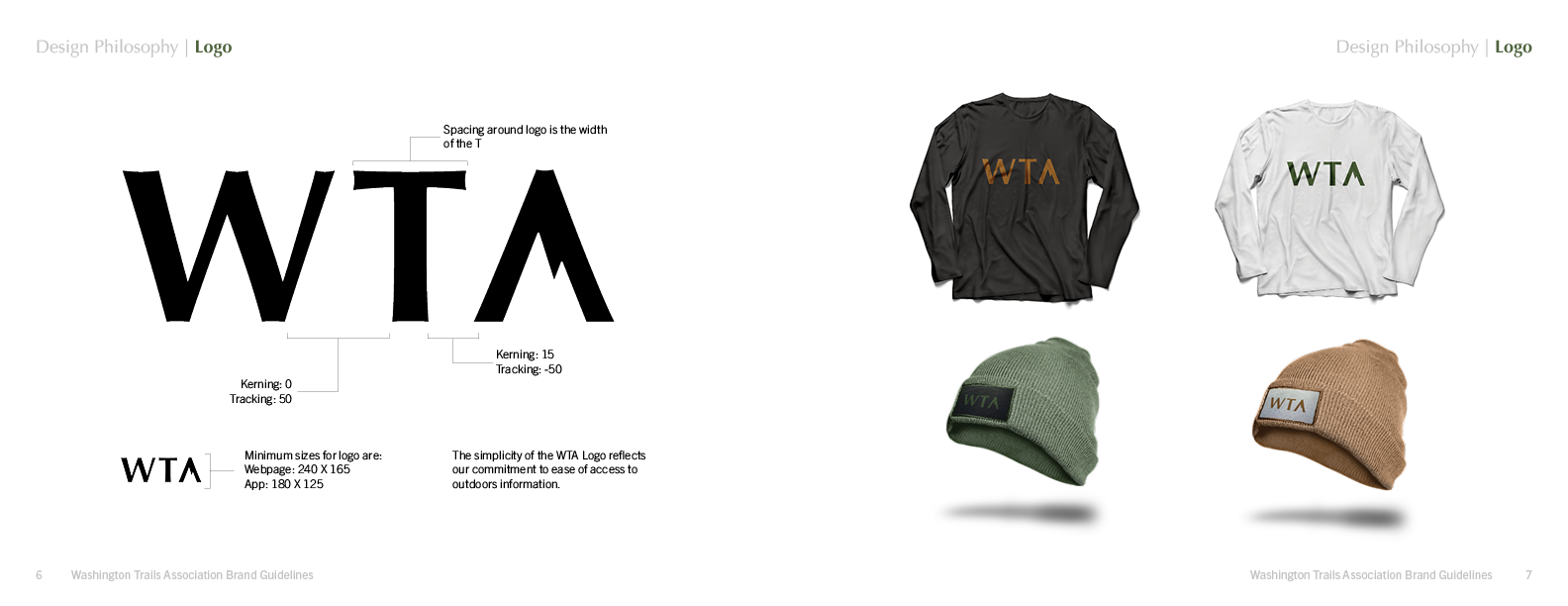
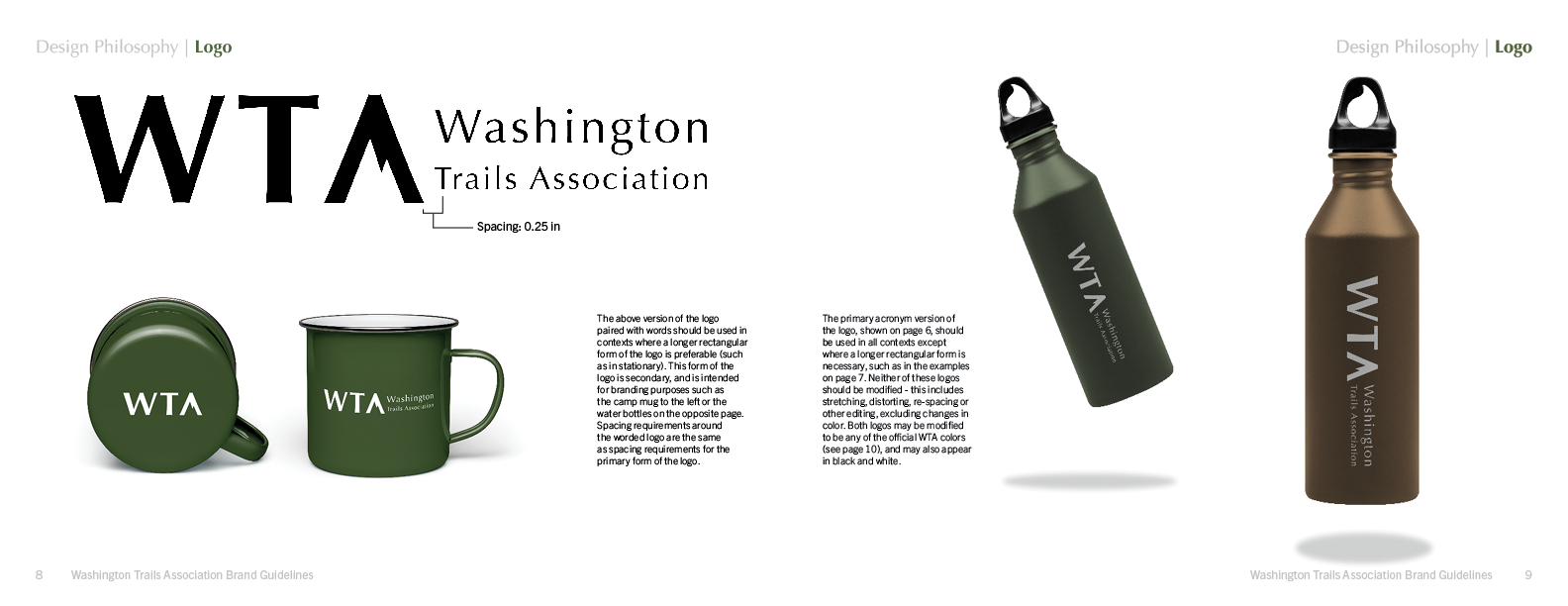
My choice to move forward with this direction was inspired by its scaleability, as well as an opportunity to challenge myself in creating a minimal look that still captured the manifold components of WTA’s brand. To reach these goals through further refinement, I focused on choosing a typeface that still preserved an essence of ruggedness and establishment. The final version of the logo uses the typeface Optima, and includes a worded version that can be used for circumstances where a rectangular logo is preferable. Details about the final version of the logo can be found on pages 6 - 9 of the final brand book, which are shown below.
Color Palette
In choosing WTA’s new color palette, I wanted to simplify from their previous palette, which included one green hue in several shades as well as a blue, yellow, black and white.Instead, I chose three hues that match colors found in Washington’s natural climates, while still being versatile enough to use strategically in app and merchandise design. The pages from the final brand book on color are shown below.
Click to enlarge
Typography
I recognized the choice of typography for Washington Trails Association as an important opportunity to convey an aspect of ruggedness and tradition while still prioritizing readability and accessibility. As an accent/header typeface I chose Optima, and paired it with Trade Gothic Next LT Pro as a body font. After trying several pairings and testing them in contexts such as App UI, pamphlets, and website text, this combination struck the most impactful balance between the visual aims of classic, simple, and rugged
The pages from the final brand book on typography and type treatment are shown below.

Image Treatment
Use of images in WTA’s current brand style seemed random and without guidelines for use. The three key principles that I established for WTA’s use of images were aimed at conveying the more service driven and communal elements of their brand, while maintaining a respect for nature’s beauty. These guidelines are further detailed in the below page on image treatment from the final brand guide.

UI Design
In redesigning interface screens for a task flow within the Washington Trails association app, I followed the guidelines detailed in the above sections. While incorporating aspects of tradition and ruggedness into the visual language, I ultimately prioritized simplicity and ease of access to reliable information. The following task flow details the steps a user might follow in order to find a hike using a custom search feature using my redesign of the Washington Trails Association App.
Click to enlarge
Once I had determined the redesigned structure of the app’s UI, I created wireframes and sought feedback from my peers and instructors on potential pain points and solutions. Most of my feedback pushed me to focus on indicating various functions through more strategic icon choices.
Click to enlarge
Click to enlarge
Click to enlarge
Click to enlarge
Aside from re-examining my icon choices, I also received notes that I had not included a call to action allowing the user to indicate they were ready to search for hikes. I had been imagining this filter and search system as a responsive application that populated results as the user filled in fields. However, through discussion with my peers and advisors, I decided to provide a clearer affordance to the user, allowing them to begin the search for the hike once they had filled in appropriate parameters. Finally, beyond these more functional aspects of the app’s UI, I added aesthetic touches in line with the above guidelines for the WTA. The final app UI screens are shown below in the brand book’s section on interface design for the Washington Trails Association.
Click to enlarge