
QuickBooks Mobile Web Redesign
Turning broken workflows into intentionally crafted experiences
The tldr: Over the course of a 12 week internship with Intuit, I co-redesigned and helped ship three improved workflows within QuickBooks mobile web: account & settings, redirection ads, and the internal tools section.
Problem one: How might we make the Account and Settings page more user friendly on mobile web?
92% of QuickBooks users change a preference on the Account and Settings page at some point, and 40% of QuickBooks customers visit the site through mobile web. Despite these staggering stats, the mobile web experience for Account and Settings was basically unusable - buttons were out of reach, key information was cut off, and common workflows were tedious and frustrating. This project set out to change that experience. These designs have shipped for QuickBooks, and currently exist in-product!
Project Goals
Redesign Account and Settings mobile web interface from the ground up while keeping visual consistency with the desktop interface of QuickBooks
Champion mobile first design principles and interaction patterns
Craft an experience that shows QuickBooks trial customers that the software is customizable and right for their business

Leveling up to Desktop
I approached the redesign with a mobile-first mindset and a secondary focus on retaining visual consistency between desktop and mobile interfaces. With this framework, our team found that checkboxes are less intuitive than toggle switches or turning certain settings on and off. This revelation was spurred by thinking about a mobile context, but we realized that this interaction would also make more sense than the current checkbox system on desktop. With the help of our lightning-fast developer team, we were able to design and implement this toggle interaction not only mobile, but on the desktop experience as well.
To see the product in action, sign up for a free trial of QuickBooks and go to the Account and Settings page on your phone’s browser.
The Process

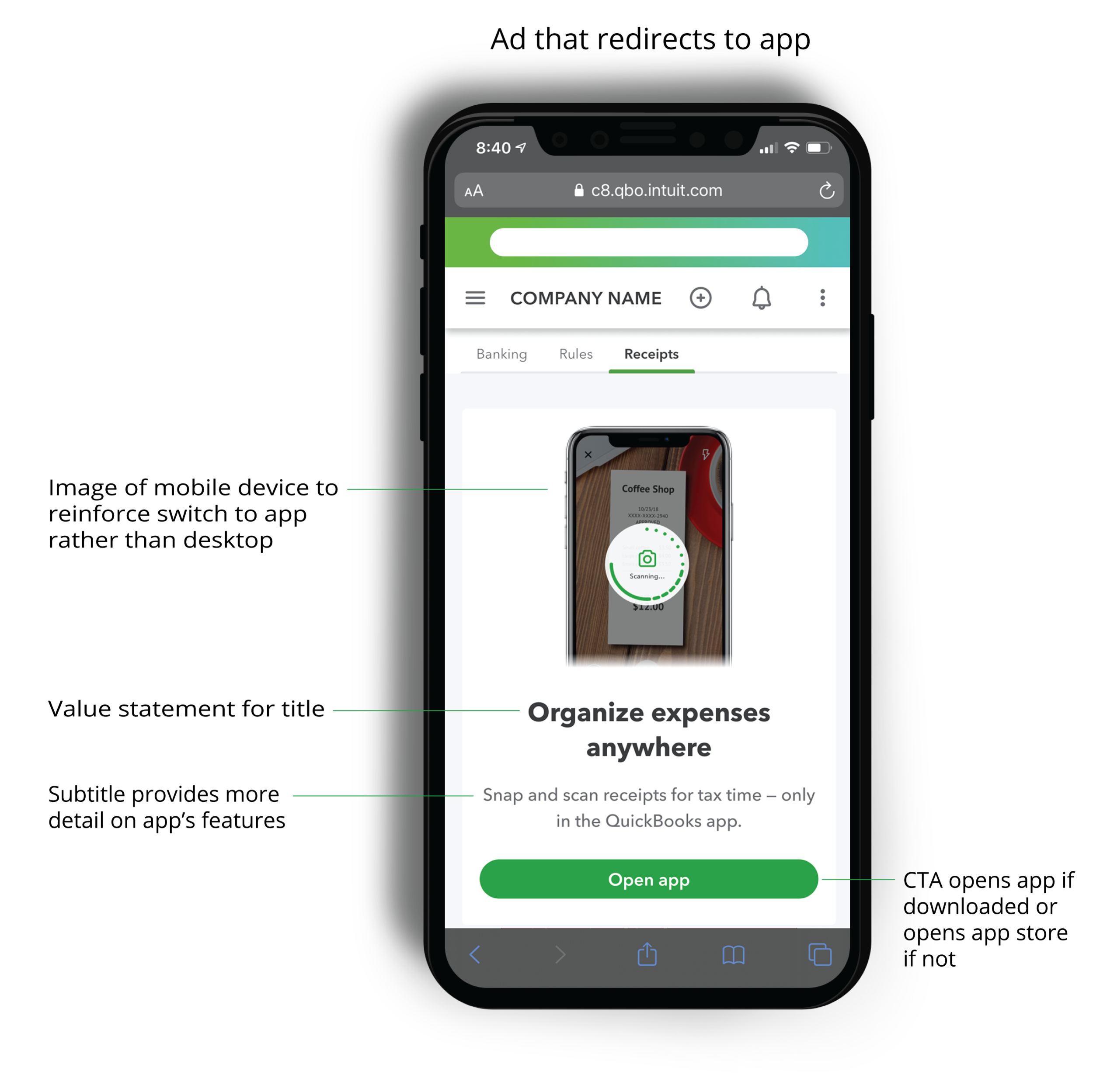
Problem two: How might we redirect users to take certain actions on desktop rather than mobile web?
After optimizing Account and Settings, there were still links in the pages that led to other pages in QBO not yet mobile optimized. Many of these pages weren’t highly used, and others (such as the print check page) didn’t make sense in a mobile context. Rather than invest precious developer time in fixing these pages, we designed a series of ads encouraging users to complete the task on desktop.
Ad Types
Our basic design for these redirect ads was a modal pop up with messaging and a call to action button. However while gathering context for this project, we realized that some of the interactions that trigger the ad wouldn’t be an ideal backdrop for a pop up ad. In order to customize the redirect experience to the specific task the user was pursuing, we created three types of ads based on the situation that would trigger them:
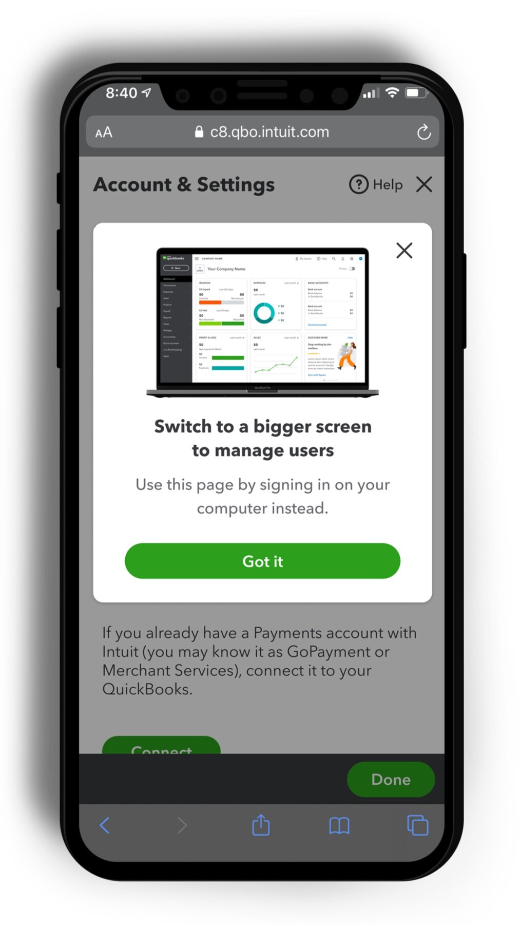
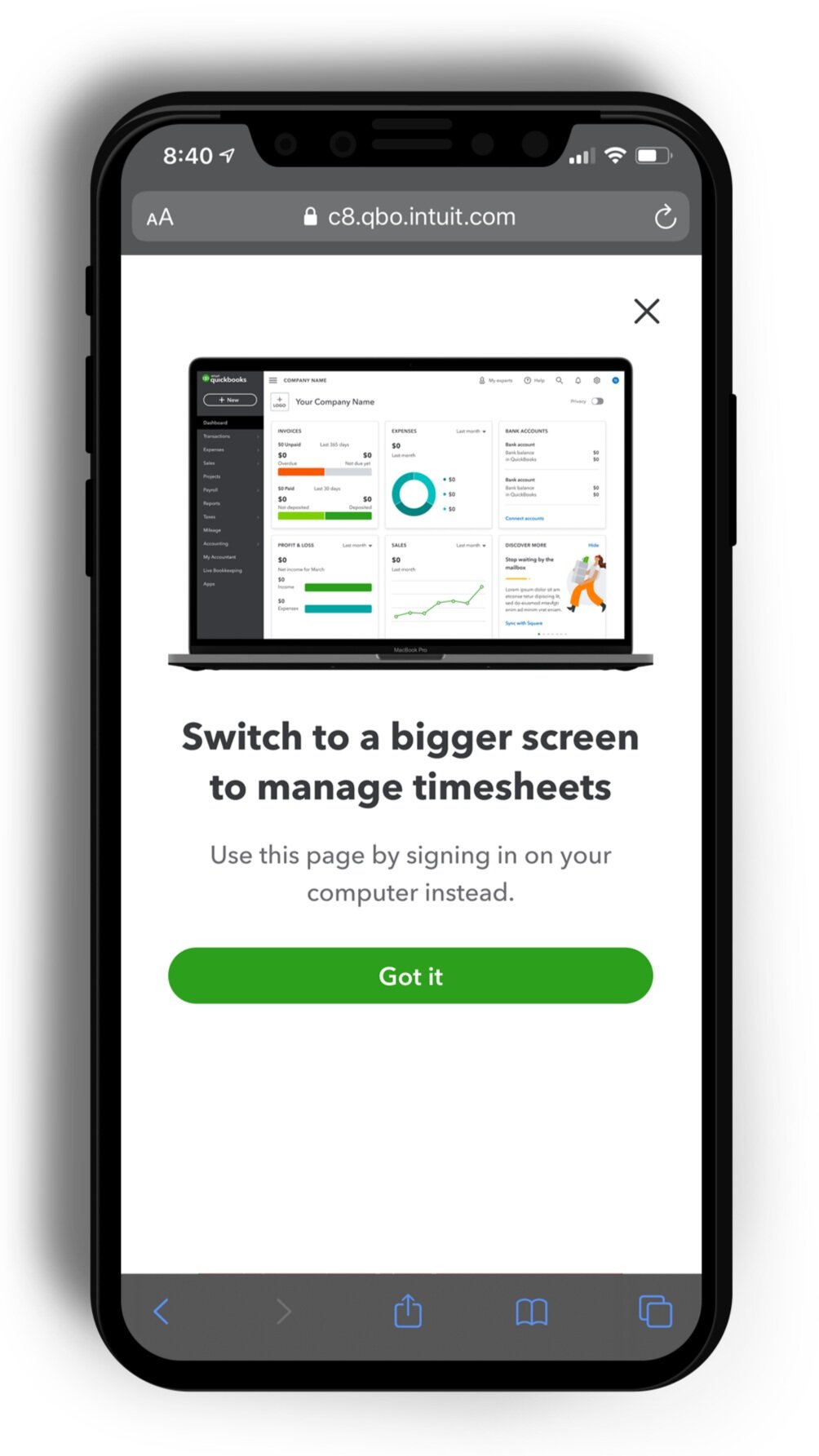
Modal Ads
Our base case ad structure was a modal triggered when a user clicks a link that leads to a broken workflow. Rather than taking the user out of their current workflow to a broken page, we simply triggered a pop up that they could exit and return to their current workflow. Ultimately, the goal with these ads was to provide minimum disruption to the user’s goals in using QuickBooks on mobile, while highlighting the benefits of trying the desktop site or app. With the goal of minimizing disruption, we categorized two other cases in which a more specialized ad form was needed.
Fullscreen Ads
Some menus in QuickBooks appear as trowsers or flyouts. When a workflow was triggered from one of these menus, it felt overly disruptive to surface a modal ad over an interaction pattern that already acts like a modal. Our solution for this use case was a full screen ad that covered the trowser and current page, so that the background wouldn’t distract from the ad’s content.
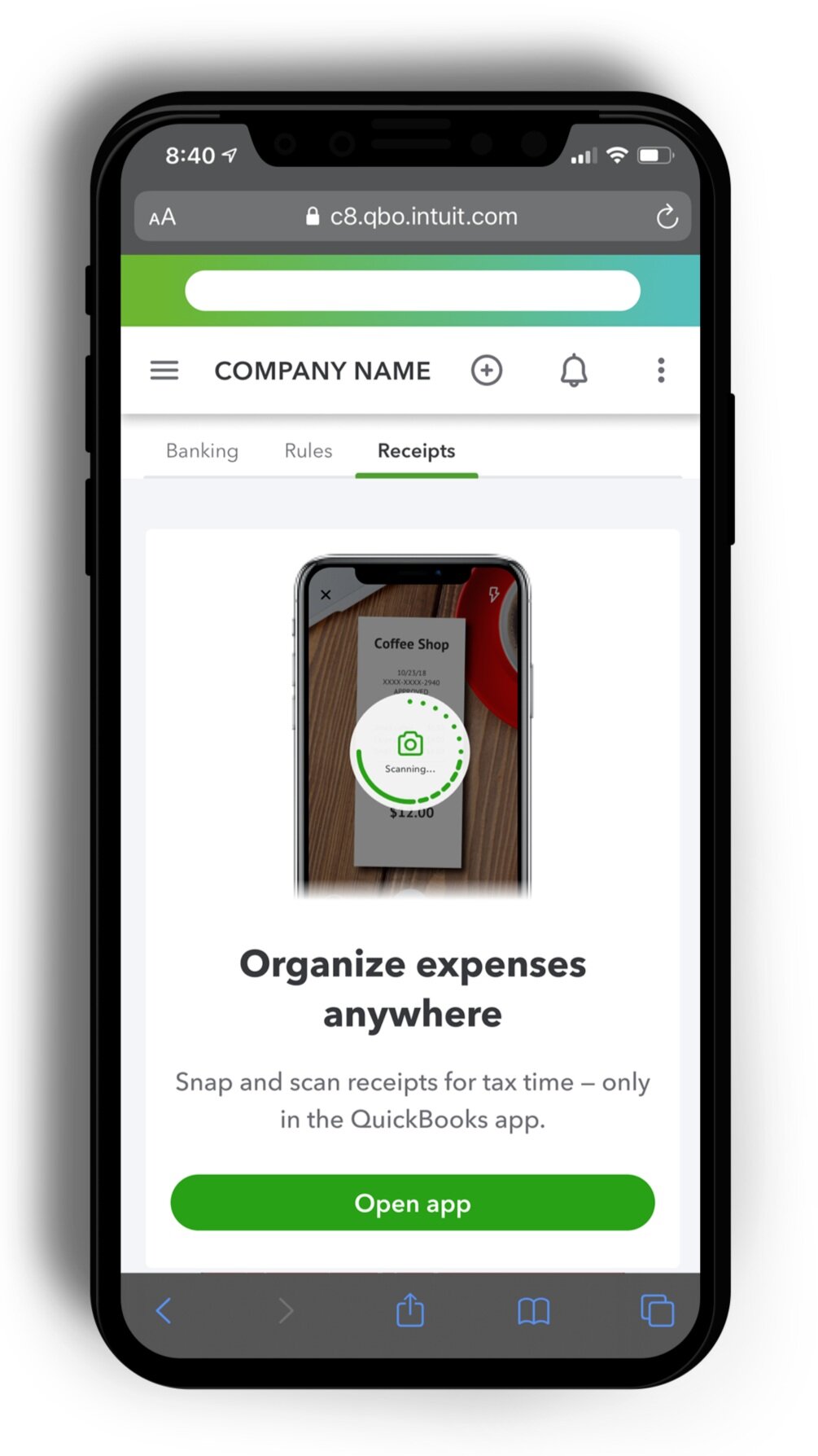
Content Blocking Ads
Finally, in some situations a page would only be partially broken or have contextual relevance that made it worth taking the user out of their current workflow. In this case, we surfaced a content blocking ad that preserved the title and navigation of the page while replacing the broken content originally in the mobile view.
Ad Layout
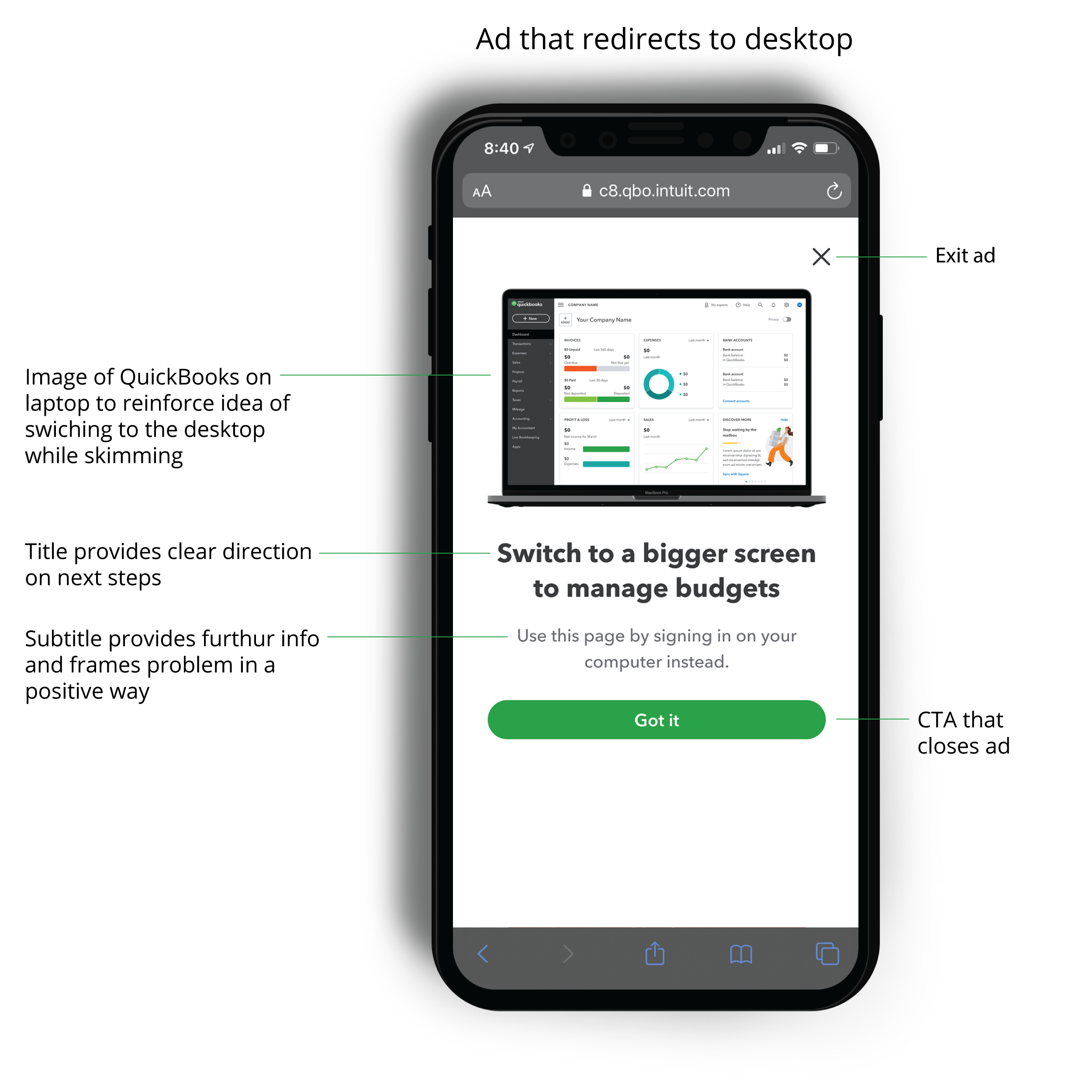
Originally the ‘Got it’ call to action was intended to do more than just close the modal. In the ideal state for these ads, ‘Got it’ would surface a notification on the desktop version of the user’s QuickBooks account. Next time the user logs in on their computer, they could click this notification and be taken to the page where they were interrupted on mobile.
We pursued building this idea through internal tools in QuickBooks, and developed a strategy that could have been implemented if we had more time to invest. However, because of the time constraints of our internship, the team decided to build the above V1 version and advocate for the connection from desktop to mobile to be built by another team.
Problem three: How might we redesign the internal tools site on mobile web to improve developer efficiency?
For our final project of the summer, we conducted a two week research and design sprint to improve the mobile experience for Intuit developers using the internal tools page. In identifying pain points and designing solutions, we were aiming for quick fixes with high impact. Because this work would be implemented by another team after we left Intuit, we focused on chunking interfaces elements into ‘mini projects’ that developers could pick up rather than something that needed to be completed start to finish.
Research
Moving into this project, we needed to switch our mindset to focus on developers as our users, rather than QuickBooks customers. However, this shift to a very accessible user group allowed us to complete four developer interviews, a survey, and data analysis in the first week. In the interviews, we followed up on survey questions and asked developers to walk us through their experience using tools on mobile web.
“[This internal tools page] is the daily bread and butter for every developer who works in QuickBooks.”
Developers particularly emphasized how often they use the Plugin Manager section of the internal tools page. Despite its importance, working in Plugin Manager on mobile web was challenging because a number of desktop interactions hadn’t been considered on mobile. Key pain points identified with the current interface are highlighted below:

Based on these pain points, we focused on fixing three key workflows that developers could tackle in chunks after our internship ended:
Searching for a plugin
Editing and saving the version number
Editing the JSON config

Click image to access a prototype of the redesigned tools experience
Design
The second week of this sprint, we focused on taking the pain points our developers brought up and hunting for low-lift design solutions. Our design solutions simply identified the key problem with each of the three workflows, and sought to remedy it
Searching for a plugin ⇨ Make search more prominent
Editing and saving the version number ⇨ Increase the size of the text field and save/cancel buttons
Editing the JSON config ⇨ Make the text field larger, and condense buttons to simplify the screen
Beyond fixing these three workflows, we wanted to clean up the Plugin Manager layout to improve efficiency of developers accessing tools on mobile web. To do so, we talked with developers about which sections of Plugin Manager they were less likely to use on mobile web, and nested less-frequently used elements in various part of the interface.
Layout redesigns
Combined the four large buttons into one drop down button under the title
Added a ⋮ menu on each plugin to hold interactions that were previously part of a horizontally scrolling table, which was difficult to use on mobile
As it’s very unlikely a developer can run a plugin on mobile, we nested the button to run a plugin under the ⋮ menu
Click on the image to the right to explore a prototype of the revised tools interface on mobile web. Or, see below for the before and after shots of each key page in the Plugin Manager.


