Summary
50% of new QuickBooks signups come from a 30 day free trial, but only 16% of those trial customers converted to a paid subscription after their free trial. Through initial research into this user group, we discovered that the product’s onboarding didn’t fit their goals for the first month of using QuickBooks - the onboarding focused on lots of manual data entry and setup, while trial users wanted to explore and evaluate the product’s fit without a lot of up front work.
In short, an onboarding that wasn’t designed for the trial mindset was causing these users to abandon the product. As a product designer on the onboarding team, I assisted with the research and led the design of an onboarding experience tailored to meet these trial users’ specific needs during their first 30 days using QuickBooks. We started with the following question:
How might we tailor the QuickBooks onboarding flow to reflect trial users needs?
The below prototype shows my final solution - read on for more in depth descriptions of the project process to produce these designs.
Final Design
Project Goals
Discover how trial users think about onboarding to QuickBooks, compared to users who buy the product for 50% off without a free trial
Identify trial users’ pain points with the current onboarding experience
Design an onboarding flow that eliminates these pain points while helping trial users get the most out of their free trial
To help achieve these goals, I contributed to and led various phases of the project as it followed a double diamond design process ⬇️ ⬇️
Project process
Click to enlarge
Research
The initial qualitative and quantitative research on trial users was conducted by a few dedicated researchers in collaboration with our team.
These researchers conducted 17 interviews and ran a survey that reached 976 trial users. In these early phases, I worked with our research team by helping define research goals, editing the script, and helping draft survey questions.
Our team worked alongside the researchers to distill the qual and quant data into three core onboarding pain points:
click to enlarge
After synthesizing the interviews and survey feedback, our team found that these trial users were going through a consistent cycle of consider, evaluate, set up/abandon. The key phase where trial users lost confidence in QuickBooks came during the evaluation phase, where they found that they weren’t able to evaluate QuickBooks without doing a lot of manual data entry. However, because these users were not committed to doing the work to set up QuickBooks, they couldn’t properly evaluate whether it worked for them. Trial users usually ended up caught in a downward spiral from this chicken and egg problem, leading to their eventual abandonment of the product.
Click to enlarge
Generative Brainstorming
Working in a large, complex organization like Intuit means bridging seams and taking many teams’ goals into account when designing end to end experiences. To do so, I planned and facilitated a series of ideation workshops with the teams who contributed to our product space, like payroll, invoicing, 3rd party app integrations, and banking.
Workshop planning and facilitation has always been one of my favorite parts of the design process, but I hadn’t run workshops of this size or with this many senior designers before. To ensure they would go smoothly, I pilot tested them with my smaller working team, talking through the activities we would do and gathering feedback before opening it up to everyone.
The final workshop I co-faciliated with these teams followed this structure:
10 minutes: Introductions and context
5 minutes: Presenting the pain points of the evaluation phase identified in research
10 minutes per pain point: Participants brainstorming solutions that could be delivered by the onboarding team, but still related to their product area
5 minutes per pain point: review and comment on others’ solutions
After everyone had listed their ideas, I affinity diagrammed and grouped these ideas to make it easier to discuss and prioritize them.

After consolidating ideas into a shareable format, I invited our design director and several design managers to review the ideas with our design team, so we could make sure the ones we were leaning toward aligned with the long and near term vision they had for QuickBooks.
The workshop I co-faciliated with our leadership team looked like this:
10 minutes: Recap the research and customer problems
30 minutes: Present a) the boldest b) the most commonly mentioned and c) the working team’s preferred ideas
15 minutes: Facilitated discussion about the strengths/weaknesses of each idea, compared to where QuickBooks as a whole was headed
5 minutes: Voting on solutions produced at the previous session, and those I mocked up in the background as we discussed merging certain ideas
After completing these two sessions and reflecting on the pain points, the ideas we decided to move forward with were:

The next step took us to one of my favorite parts of the design process, where design and research start to hold hands in earnest - user testing these concepts!
User testing
Up to this point, I had co-driven this project alongside my other design partners. As we pivoted from the generative to the convergent phases of the project, my collaborators shifted into advisory roles, so that I could lean into the the sticky interaction and visual design problems that I was itching to practice solving in a large enterprise setting. This structure meant I checked in a few times a week to share concepts and swap ideas, but was the main designer prototyping, mocking up ideas, and bringing to life the above concepts.
We decided to break apart and test these concepts independently before creating a holistic flow. To experiment with social proof, I began by setting meetings with researchers, data analysts, and QuickBooks marketers to find out what types of social claims about our product they had verified, so that we could test with content that was at least similar if not exactly what we would be able to show users in a live product. I knew that social proof had been proposed as a solution to other design problems across QuickBooks, and had a hunch that it might be difficult to accurately capture and report. Digging into this hunch was my first step.
In the meantime, we began setting up moderated user tests to dig into our second concept: capturing broad user goals. As in any research session, users will be more honest in their critical feedback if they know the project is in early, rough stages, so we started with an onboarding flow that had barebones interaction and minimal visual design to get an honest read on the structure of our intent capture. See the full prototype we tested with users below.
The meat of this user testing round was a page we call intent picker. In the control flow that this project would be tested against, intent picker was a list of specific tasks that users could do in QuickBooks (see below). What users selected on this page determined what tasks up in the rest of their onboarding flow and what tasks showed up on their setup checklist when they landed on the homepage.
However, trial users have broader goals that they don’t know how to distill into these specific tasks - so we still asked them about why they came to QuickBooks, but wrote the answer options at a higher level of granularity, like ‘bookkeeping’, ‘manage sales’ and ‘banking.’ After a user had selected a few of these high level goals, we showed them specific tasks that laddered up to that goal, to help make the connection between their goals and specific actions they could take in QuickBooks

Click to enlarge
To tackle our final idea, grouping questions, I first listed out all of the questions in the current onboarding flow, and did my own card sort activities to come up with different groupings. Once I had landed on a grouping I felt would make the most sense to users given our research, I began to explore visual ways to communicate that these questions were grouped.
Click to enlarge
As I refined each of these explorations, I began to merge the concepts into a cohesive flow that we could use for the final round of user testing. After meeting with data analysts and researchers to craft true social proof statements that we could test with users, I decided to have social proof live in the sidebar of the prototype, an area that we were using as a) a place to provide section-level information on what part of the flow a user was in, b) a place to provide secondary information without interrupting the main focus of the page, and c) a nod to the QuickBooks sidebar, which would show up as a navigational element after the user completed this onboarding flow

The prototype we used for our last round of unmoderated user testing is embedded below. On usertesting.com, I input the link to the prototype and wrote a script asking the user to ‘think out loud’ as they went through it, telling us anything they particularly liked or didn’t like, and what they noticed about how the UI responded to their selections.
In particular, we asked the users to stop on a few pages and give us more feedback, so we could dig into the pain points we had discovered during research and whether our solutions addressed them.
The first of these pages was the social proof page, where we asked users whether social proof had the expected effect of building their confidence in QuickBooks.
Surprisingly, social proof didn’t test well - often times, users were so focused on completing the questions in the right sidebar that they didn’t even notice the social proof appear. When my instructions in usertesting.com called their attention to it, users told us that it felt somewhat broad, and that it would have to be incredibly specific to their industry, business size, or other highly unique factors to feel meaningful.
Next, we asked users for feedback on the transition screens that we showed between groupings of questions. Here, we probed for information on whether the question grouping was meaningful, and whether the transition screens had meaningful impact on users’ perception of usefulness and ease of onboarding.
Overwhelmingly, users responded well to grouping questions into sections. They told us that having a progress bar that clearly denoted the number of sections was encouraging, as it helped users expect what sort of questions they might need to answer and what information they might need to pull up and reference. Interestingly however, users said that the transition screens did nothing more than signal a section was ending. The content was too vague and generic to really encourage them or build confidence - it was actual completion of questions, rather than messaging, that spurred this sense of accomplishment.
Finally, we had trial users stop on the progressive intent picker page, to understand if it helped them connect their broad goals to specific actions they could take. Users responded well to the concept of the progressive intent picker, and said that goals like “Bookkeeping”, “See what I make & spend”, and “Send & track invoices” were at a level of granularity that matched their goals. However, they had trouble with the interaction - trial users wanted to be able to select these high level goals rather than specific sub-tasks. They also wanted to see references to their goals (rather than prompts to do specific tasks) carried throughout the rest of QuickBooks onboarding.
Essentially we learned that to cater to goal-oriented trial users, we would need to create a new framework that tied all tasks to specific goals throughout the end to end onboarding experience, rather than connecting their goals to specific tasks one time.
Pivoting
Based on these test results, as well as the priorities and resources of our larger cross functional team, our design and PM team came together to make a series of decisions about the direction of the final flow:
We wouldn’t invest in social proof right now, as our data analysis models weren’t advanced enough to provide the type of ultra-personalized feedback users needed to feel confident
We would lean into grouping questions, but reframe transition screens to focus on what was coming next rather than generic celebration messages
Although progressive intent picker as a concept tested well, we knew it would take some time and a few more rounds of testing to get the interaction right. We decided to separate this project from the overall trial user flow, and continue to iterate on it as its own experiment. About a year later, I ended up designing and launching a refined version of the progressive intent picker!
Outside of the specific pages we sought feedback on, we realized that the sidebar layout was leading to a cluttered overuse of visuals. Although we wanted this version of the onboarding flow to be more delightful than the barebones versions of the past, we needed to strike a balance. Ultimately, we decided on a color block header for each section rather than on every page, with a visual that represented of that section. This way, each section still had an element of delight, but the visuals on tiles in each question could stand on their own.
To revisit the final designs, see the top of this page or check out the prototype here.
Responsive design and Final specs
At QuickBooks, we’re encouraged to design with a mobile-first approach. However, because the majority of our current user base goes through QuickBooks onboarding on web, our team decided to test on web, while creating simultaneous mobile designs to keep us aware of constraints. Now that we were narrowing in a specific direction, I fleshed out the specifics of each screen on mobile, and layed them out next to the web screen in the final design handoff file. Here are a few examples:
Click to enlarge
Because this flow was built on web, not for the native app, the mobile screens are simply one of several responsive breakpoints I designed for. As the web screen shrinks, the 12 column fluid grid system dictates the width of the graphics and text of each screen at each breakpoint. This way, the design responds and looks intentional no matter whether the user’s screen is one of the standard breakpoint sizes shown below, or a screen size in between.

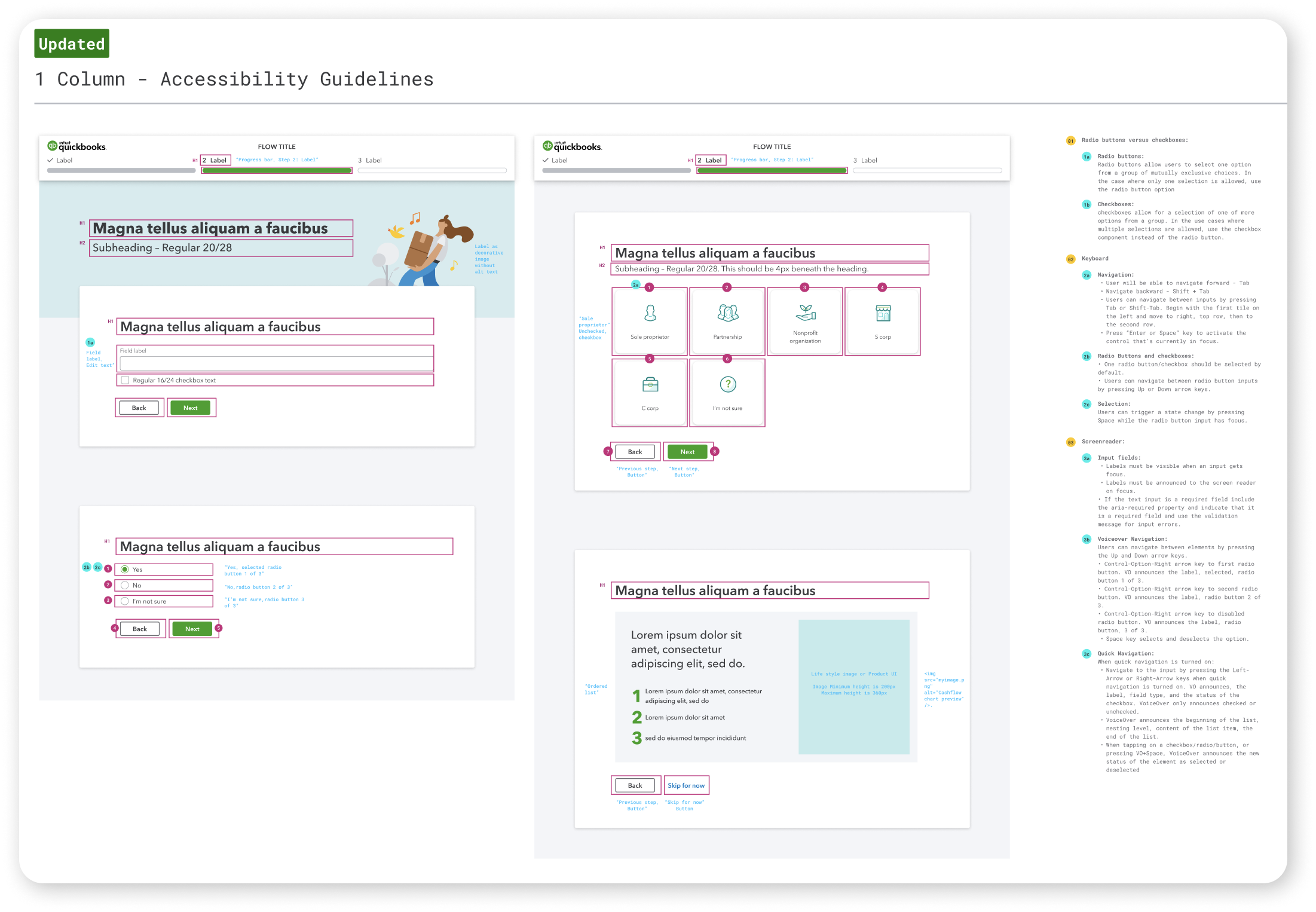
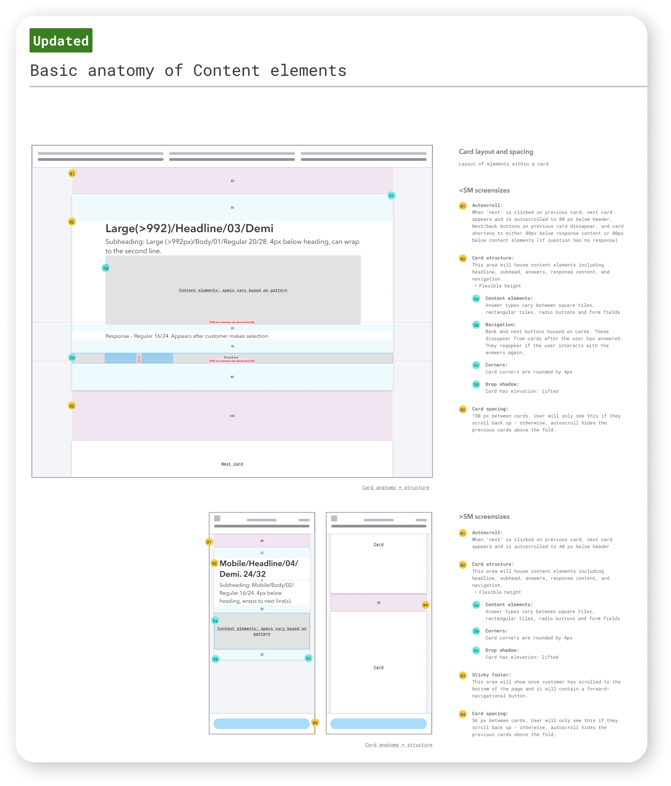
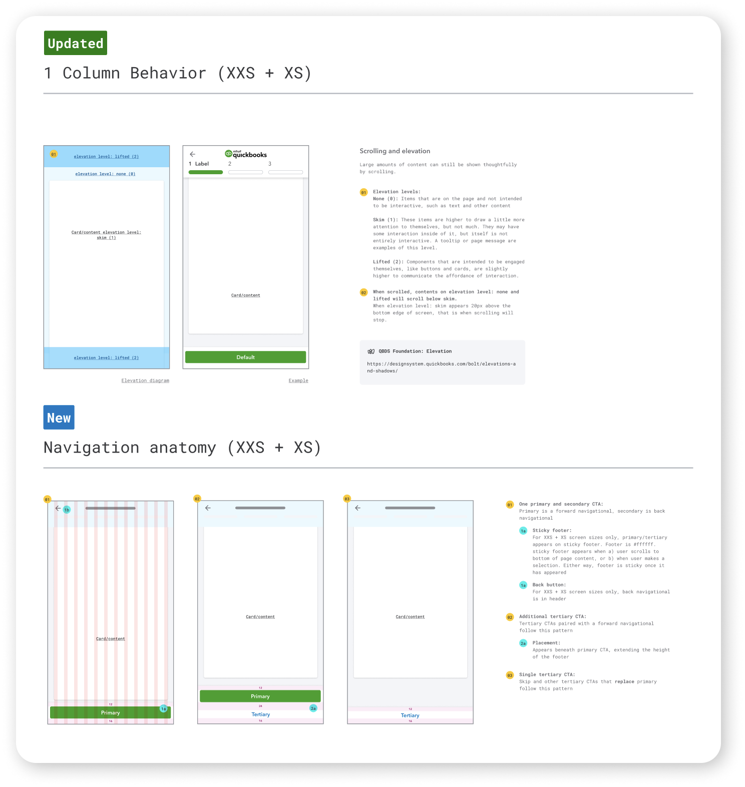
Beyond simply responsive behavior, I specced out accessibility guidelines, interactive reusable components like cards and the progress bar, and text hierachy. My final spec document covered high level information, from the ordering and transitions between questions, to detailed interactions like the placement and hover states of buttons:
Impact
Ultimately, priority shifts within QuickBooks de-emphasized trial users as a key audience, and our team didn’t end up implementing this flow as one cohesive experiment. However, many of the concepts we tested and iterated on worked their way into later experiments for trial users and other audience segments. For example, a few months later when I was designing a more complex and in depth version of the onboarding flow for a different audience, transition screens, became key to correctly pacing and directing focus in the flow. Because we had already tested different content and visual structures for the transition screens, I was able to virtually re-use the designs from this flow, saving us weeks of user testing and consolidating insights.
Personally, if I were to re-do this project, I would invest more time in early generative visual ideation. There are so many visual directions we could have taken this flow, and showing users more options in those early user tests could have provided us invaluable information for not only this project, but future onboarding redesigns as well. As it was, I learned an incredible amount about the nitty gritty of interaction design, thinking across responsive breakpoints, and translating nebulous findings into concrete solutions. The freedom that my supervising principal designers gave me on this project required a lot of trust for someone new to the organization, and I’m eternally grateful for their patience, guidance, and collaboration. This support encouraged and taught me to not only craft a clear strategy, but make the design choices needed to execute on the vision.